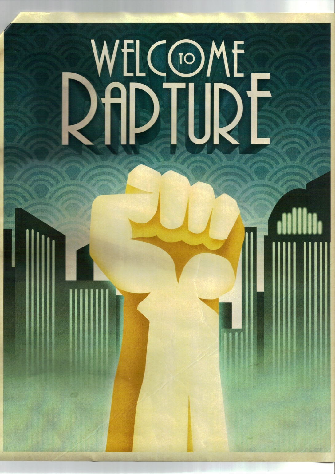
 All throughout the game, really unique 1960's inspired art can be seen on the walls that use an art deco style. I really like the way they look and have influenced the way my final instructional diagram looks alot.
I went for a more art deco feel with mine, as the previous 'psychadelic' feel wasn't really working.


Here the art focuses on geometric shapes and illustrations without outlines which I tried to capture with my illustrations. The colours are also less restricted or wacky.
Pattern is used often, and they seem to express a very rigid format of title-image-subtitle, which was echoed in my design.
Texture overlays are also used here to give that aged feel, and it works well.
The fonts are less wacky and more rigid, and these ones were done using pre-rendered fonts. I want to still withhold some handmade-ness to my design so will hand-rendered lettering.
No comments:
Post a Comment