Friday, 21 October 2011

More cheshire cats!

After doing the previous animation tests, I was inspired by some of the .GIFs I collected to make the face swirl as it it were going to disappear.
It was done simple on Photoshop and the outcome is really nice. The second one is better when the face gets smaller as it swirls but I think that this would be quite hard to replicate with traditional mediums.
(Im not sure if I have said this, but I want to make the final thing in a traditional way because I like the slight imperfections that happen.)

I also did another of the rubing out ones, but using a more stlyized way to draw the cat. I drew it more simply so I dont loose detail in the Zoetrope. It also has more of an identity.

Anyway, I still think there is too much going on and I should aim to restrict the movement.

Thursday, 20 October 2011

Cheshire Cat inspirations...


Here is a collection of animated .GIFs from various versions of Alice in Wonderland each showing a different way they interpret the Cheshire Cat, particularly the way he might move or appear.


These first few are made from footage of the recent 'Alice in Wonderland' film by Tim Burton. They were all found via google image searches.
This one at the top is rather unsettling.. The cat's head just floating in and smiling with his huge eyes.

I just love the way he spins and his body just materializes on the one above. This would be fantastic to replicate but would be hard maybe with 15 frames.
I also love the look on his face here as he disappears. Its so human.

Here is my favorite animated .GIF, the way the cat swirls and fades into the surroundings it wonderful. This would be fairly easy to do digitally to a drawing of a Cheshire cat face, but using a distortion filter on photoshop.
However would be very time consuming and difficult to do traditionally   


This of course is from the original Disney animation of Alice in Wonderland which at the time would have been created with traditonal mediums much like I would do, but not be used for a Zoetrope.
I like how the striped of the Cheshire cat unwind as he disappears, its a very original idea and probably one of the first times an audience have seen a moving representation of the cat.


Looking at these for reference have been good to get my ideas flowing, and given me a little inspiration for how the cat will looks aswell as how he will move or be animated. 

Wednesday, 19 October 2011

Cheshire's smile animations

After making my Llama animation insert, I decided to have a little go at something else as I felt it didn't turn out as good as I had imagined. I was watching Tin Burton's 'Alice in Wonderland' and was inspired to make an animation centered around the Cheshire Cat.
It seems almost obvious, trying to capture the magic and mystery of his character with animation. The way he appears and moves around will be fun to play with.
Also when viewed in the Zoetrope, I imagine it will look rather magical. The slight flickering that happens with the device will add a really nice antique effect and echo the time of the Zoetropes creation, when moving images really were magical.

These are some initial ideas, playing around with the cats face and having it disappear and reappear. The first one has his eyes stay there as the face fades and the bottom has his whole face fade.

This is a kind of standard for images of the cheshire cat, the fading face seems to be very recognizable. Looking at the actual way ive drawn the cat, I don't like it. I've taken too much influence from the Tim Burton style [gothic and bit evil] and I really want to create my own version of him and make it really unique.
There is also too much dark colours and detail that would blur in the Zoetrope. 


This one shows the face fading slowly so that eventually it all disappears around his eyes. This is quite nice and works well as just lines.
I don't think it would be as successful with colour, which dosen't really effect much.


I did this one, trying to get a full body of the cat and do the same fading trick. [All i do is to rub out the cat and save every now and then as I go along. This would be easy to do traditional as I would trace over the previous image but draw less of it.]
I like this one alot and I prefer the cuter and plumper way I drew the cat.

I printed off this version and the one above to go in my little Zoetrope and although they were quite small and subsequently a little blurred, the animation worked well, if not a little fast.
I think that making the whole body disappear is a bit much to do in just 15 frames when put into a Zoetrope becuase the animation is way too fast.
Lest rethink what the Chesire Cat will be doing...

Friday, 14 October 2011

Revised Llama animations


Here is the final design for the running llama animation, again using the camel rotoscope as a base. It is a little crude and rough but i like that as it present a fun little edge and makes the llama look funnier, which is what Im going for. [I dont think a running llama could be taken seriously anyway!]

I printed it off small to fit into my homemade zoetrope and it moved rather nicely. Due to it being small though, it was a little hard to see but im hoping that when it is blown up and with cleaner lines it will move more smoothly.

I will replicate this traditionally using the digital form as a template. I think it will turn out quite well.

The one below is an attempt at putting a rider on top of the llama, however it hasn't turned out so well so I dont think I will pursue with the idea as it may distract too much from the motion of the llama.
Plus its takes twice as long to do, and dosen't look as nice.

Mini Zoetrope with running camel insert

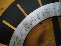
Here are some photos of a mini Zoetrope I made to test out the digital animations and see how they worked.
I made it simply, with black card and cut out the slots and made strips along the bottom to keep it rigid.
I attached thread to the outside on the device so it can be held up, spun and viewed. Considering it is a little rustic, it works very well!


 I printed off the camel frames onto paper [each frame was 4cm long and 5cm high] and popped it inside the zoetrope and spun! The animation looked amazing! Much better then the digital version, because it was more blurred and so you didn't notice that some of the lines didn't match up to well and it was a bit wobbly.
It might also have helped that the zoetrope is in a small scale so it will appear more blurred. However for all the blurring, it was still clear was was going on and really looked like a camel running.The actual Zoetrope measures 20cm in diameter and the circumference is 60 cm. The insert was 60x5cm.
This makes my one about a third of the size of the one at the college.

Below is a video of the camel zoetrope, and also one with the 'Viking Portal' animation I made.
The videos are a bit unclear, but it looks much nicer in real life!
The Viking one is much too feint and so it is hard to see the details. It shows how the bolder the design, the better the animation.


Camel Rotoscope


This is a Camel Rotoscope, made my drawing over Eadweard Muybridge's stills of a camel running. I chose an camel as I felt it was closest to a Llama than a horse would be. 
Its quite rough and jumpy, but I think I captures the leg movement quite well, which was the point of the experiment. 
It is 15 frames long and loops rather well.
This might prove a good base to work ontop of with the Llama animation. I think I may just change it to the Llama running instead of jumping because It may be alot of work otherwise. 

 I then put the original Muybridge frames together to see how the actual camel would have run, and also make it easier to use for rotoscoping in the future. The looping is good, and the motion fluid. Good job Muybridge!

Thursday, 13 October 2011

Digital Animation Experiment

Here is another little digital animation that I did to practise. It has about 13 frames and shows my little viking character from the comic bit, falling through some portals. The portal idea was from a videogame called 'Portal' in which you can create portals, one blue and one orange, that you can use to walk through.
The idea behind this is that hes made a portal on the floor, then one above him and is so falling for eternity.
It was a little complex in the end becuase I had to have certain parts of him poking out of each portal to look like he is continuoslly falling.
It isnt very smooth, and he jumps to the left at the end, but it was a good little practise. 


Wednesday, 12 October 2011

Llama animation rough


Its very crude and rough at the moment, but its a good idea of how I want my animation to look like!
Click on the picture to see it moving!

And here is an also very crude Rotoscope of a Llama walking.. Its so difficult to find a good video of llamas walking! Hence there is only 4 frames...

[The llama starts off facing you, then walks to the left..]

Monday, 10 October 2011

Jonny Duddle - The Pirate-Cruncher


'The Pirate Cruncher' is an awesome book i bought with 'A Bit Lost' and its so different but still just as awesome.
This time the book has comic strip style illustrations in it that seamlessly blends with the full page illustrations and adds a good storytelling element to tell more on one page. 

The style of the illustrations is wonderful and is created digitally. It seems very painterly as apposed to the normal bold and graphic digital work of other artists and could easily have been done with acrylic paints.

The digital renedering though, adds rich colour nd added textures and it also plays better with the text. It being directly involved with the illustrations and complimenting.


The pirate characters are larger than life and really funny which makes it so appealing and adds to the bright and happy style.

I really like the comic strip scenes spread throughout the book and they work really well to get as much going on in a double page spread as possible. The pages are cut into tall rectangles which follow in quick succession to get a good feel of the action, and it works really well.
I really love this books and its a joy to read and just look at. I wouldnt hope to create anything to this standard just yet, but it gives a good idea of how digital outcomes can looks great in a childrens book and in turn looks great as a sequential image.
Its far removed from traditonal comics and has a graphic novel feel to it, but its for children. [and big kids too!]

Chris Haughton - A Bit Lost


Here is a lovely children's book i bought the other day called 'A Bit Lost' by Chris Haughton. I couldn't resist buying this for the lovely story and amazingly cute illustrations.

Ive chosen to just look at the style here, and in terms of sequential illustration, its only sequential in its format as a picture book really.

All of the illustrations are created in a really appealing collage style, whether it is real collage or not, im unsure but the images feel as if they are layers of torn coloured papers layered over each other. If you look at the bear, the slightly frayed edges give a collage feel and the tones also suggest this as they seem to be the muted colours of sugar paper.
Anyway, it creates a really nice crafty feel and makes it more appealing to a wide audience in my opinion. It would appeal to children because the forms are big and bold and its easy to understand what is happening, but i also think it would appeal to am older audience because of the crafty feel and the fact that its really really cute.
I really adore this style an think it could be achievable providing I had lots of the same and slightly varying colours and restricted myself to using angular shapes. It could be easier to create digital too, if i loosened up the way I worked...
Overall though, I think if done right, collage mediums can fit in very well with ' style illustration and is something id definitely like to explore a bit more in the future.

Sequential comic concertina books...

Here are a few little concertina style books I made, as a way to experiment with the constraints of a 5 page comic and the idea of sequential images, be it as a traditional comic or an elongated scene spread over 5 pages.


This was done for illustration friday this week under the topic 'Contraption'. I wanted to play with one scene being spread along the whole book and keeping to a restricted palette of purple and brown. Overall I really like it! I used layering and made some of the cut out pieces stick out from the background to add depth, like what I did with my viking one.
The image is supposed to be looked at as a whole but each page still looks complete on its own.


This is the result of a hilarious train journey a friend, and she came up with the characters which I incorporated into a concertina comic for her.
The comic is read from the outside-in. [Ie. read the first page, then the last, then the second, second to last and finally the middle page.]
This was fun to do as its a very unconventional flow to the comic and the imagery was humorous, which I try to include in most of my works. The restricted palette works nicely and the layering and relief makes the characters stand out and also elevates the comic to being more than 'just a comic'.


This is another one... But this time a kinda 'bestiary' of 'minions'. 
Its not quite sequential but it is in terms of the layout and medium. The colours dont really jell on this one, but its still quite cute and funny. 


This last one shows characters from a planned storybook [personal work] called 'The Mushroom Fairies.'
It shows a few of the different coloured fairies set against a watercolour background and silhouette town. I really love the looks of the background but think that the colours of the mushrooms could be more refined and compliment the background more. 


They look like a big happy familly! How sweet! :)


Monday, 3 October 2011

Howl's Moving Castle- Storyboards

Animation storyboards are an interesting form of sequential imaging, as their purpose is to effectively communicate camera angles and motion to the animators. They are the backbone of any animation or anything recorded on video (film etc). 

Each frame is roughly sketched, as can be seen in these storyboards for Studio Ghibli's adaptation of 'Howl's Moving Castle', and sometimes washes of colour are added to help define forms or express a certain mood that the animators can replicate when fleshing it out. 
Storyboards are useful for creating comics because you can easily map out how the panels with flow and work out the flow of the story. They're essentially rough comic strip mock ups.


Anyway, as pieces of art themselves I really love to look at them and especially these ones from the 'Howl's Moving Castle' artbook. I love the rough and ready nature and the lovely watercolour washes over the loose pencil lines.
Id love to replicate this sort of roughness, but still withhold in the intentional nature of it (ie. so they still look like finished illustrations and not just rushed sketches.)

Looking at these would help greatly for comic strips or sequential illustrations that rely heavily on action, the sketchy nature helps to create a dynamic feel and the transitions between them reflect the intensity of the scene when animated so i can provide alot of help with making an exciting comic scene.

I mostly just love storyboards, and I also love this film which constantly inspires me.  

Easterm Style Comics- Manga

Eastern styled comics have a very different feel to those of western art. The comics are read from right to left (the way Japanese read) and they adopt a 'Manga' style of characteristically. Ill have a look at one manga comic 'Full Metal Alchemist'.

Firstly, eastern manga comics are drawn in a 'Manga' style which is known for exaggerating character's eyes and other features and using more rounded figures. The art is often black and white, which contrast with the more common coloured artwork in eastern comics like Marvel etc.


This particular style found in FMA (drawn by Hiromu Arakawa) is one of my favorites because the characters are robust and rounded and you get a good sense of them in their surroundings. She also uses a lot of exaggeration which can bring in alot of humor and show of emotion or action.

In terms of sequential images, the frames are very mosaic like and fit together nicely as boxes. Its very easy to read and the panels flow nicely, telling the story well. Sometimes elements appear out of the boundaries of the frames which accentuate action of helps to focus on a certain point/direct attention to somewhere else.

I really love the art style of this manga in particular with the 'screentones' applied that add shading and effects. It is very cleverly done and looks beautiful.

Nick Hayes- The Rime of the Modern Mariner


'The Rime of the Modern Mariner' is a fantastic graphic novel that i bought last year and is an interesting retelling of a classic tale 'The rime of the ancient mariner'.
I just love this books and its a joy to read as well as beautifully illustrated throughout. It has a lovely blue colour palette, focusing a few desaturated blues and black on the off white paper. It creates a great nautical feel and helps make the piece as a whole work together.


The drawings are very stylized and often intricate with lots of texture thrown in. The drawings frequently go outside of the boundaries of the panels and create obscure shapes which make it make it more interesting to read.
I especially love the typeface that accompanies the illustrations, it fits so well and I love the way the size changes so that the words fit nicely between the frames.


It also has a really nice print feel to it, although it seems to be digitally produced. The handmade feel this gives makes it much more desirable and interesting to me.

Id love to create something as complete as this with the wonderful restricted colour palette and awesome typeface. I think this could come in handy for the instructional illustration part of the module as a way to make it engaging to the viewer. Which is important for instructions...


Lilli Carre- Woodsman Pete

I love Woodsman Pete! The comic stips are so funny! 
They're drawn in a simple but unique style that really helps increase the comedy and the simple layout of the pages make them really simple to follow.
I also love the 'headers' on top of the strips which are different each time and add a nice variety to the comic strips.