They also just looks better!
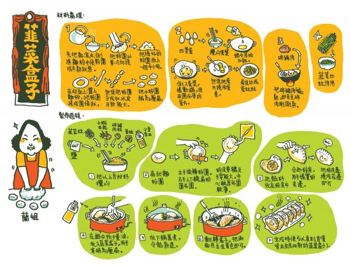
This really nice one is by Stella So, and i just love the design. The black and white illustrations work really nicely against the blobs of yellow and green and the little areas of colour within the illustrations help lift the design. Even though it is in japanese, the recipe is still follow-able becuase of the drawings, which makes this kind of instruction universal.
I think simple is generally better becuase it can get very confusing to follow.
I like this alot.
 I really love this recipe too, by Maureen Shaughnessy. It looks straight out of a journal and probably is, and it therefore feels much more personal.
Although a little unlcear and somewhat messy (which i actually like) the illustrations really help and give a good idea of the processes of making the sushi.
I like the way that there dosen't see mto be a preconceived layout for the design which gives it a loose and organic feel.
Although clean and simple has its place, so does this journal/note taking form. It would fit well into a kind of kitchen/garden cookbook, or something as more of a stylised gift.
I think that I will go for more of a composed design however, and it can looks a bit messy. THe original can be found here: http://www.flickr.com/photos/montanaraven/18461280/in/photostream/

The illustrations are cartoony and the crayon style colouring gives off a nice naivity that would make the piece feel more inviting and maybe even easy to make.
This naivity would work well in a set of instructions for a younger audience.
I really like the way it is layed out, with the comic stylr frames that looks to be almost like building blocks. the hand rendered style font is really nice too.
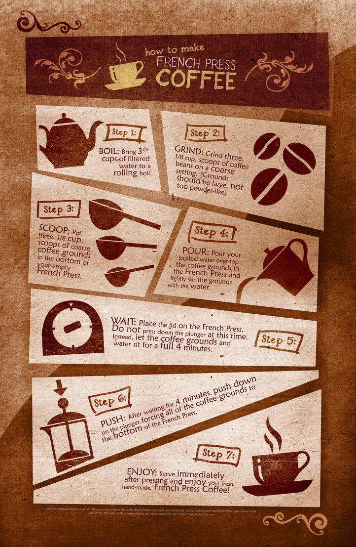
I think its important in an instructional diagram to go simple with the illustrations and make sure it is clear what they are depicting.
Also a restricted pallette is good to make the whole thing come together.
No comments:
Post a Comment