Sunday 6 November 2011

Bioshock- 1960's vintage style video game art

More art from video games. This time, from Bioshock. A very unique and stylized horror game set in a fictional underwater city called Rapture that had got into disrepair.. Just a little.
All throughout the game, really unique 1960's inspired art can be seen on the walls that use an art deco style. I really like the way they look and have influenced the way my final instructional diagram looks alot.
I went for a more art deco feel with mine, as the previous 'psychadelic' feel wasn't really working.


Here the art focuses on geometric shapes and illustrations without outlines which I tried to capture with my illustrations. The colours are also less restricted or wacky.
Pattern is used often, and they seem to express a very rigid format of title-image-subtitle, which was echoed in my design.
Texture overlays are also used here to give that aged feel, and it works well.
The fonts are less wacky and more rigid, and these ones were done using pre-rendered fonts. I want to still withhold some handmade-ness to my design so will hand-rendered lettering.

Pietari Posti

I absolutely adore Pietari Posti's work! Its so intricate and beautiful and has a lovely vintage feel. The pieces remind me of old book cover illustrations that you would get as a child.

The line work is wonderful, so many intricate swirls and details coupled with large doses of flat colour. It creates a lovely contrast and also gives a lovely screen print feel.
The colour choice is sensitive often using contrasting tones for better impact or similarly muted tones to give a more serene feel, and also echoing the vintage feel.
I particularly love these bookmarks which are sequential in themselves and looks lovely. The main bodies display contrasting swirls against a dark sea background and the characters popping up from the sea are beautifully detailed. The cut out areas have a little outline like with my work, that makes the bookmarks more robust but also makes them stand out.

The work is really inspiring, using restricted colour palettes yet again, and intricate details and pasterns that really set the image off. Another important thing, is the fact that often alot of white is left on the illustration which highlights the characters and creates a better contrast.
I love these!

Friday 4 November 2011

Tom Whalen


Whilst browsing for 1950/60's influences I came across the work of Tom Whalen who creates lots of really cool movie posters for old and new films, but makes then looks vintage.
I absolutely love them! He always uses a restricted palette of the kinds of colours seen in old illustrations that just scream vintage.
The style of the artwork is great, with the exaggerated features and proportions of the characters. The illustrations are clean and capture the characters nicely.


I love the modern style font he uses with them, it creates a really nice contrast and fits with the artwork. He uses only a few colours and is masterful with them. The wolfman one for example only has 3 colours but looks great!

The pieces seem to be created in Illustrator due to the clean lines and vector feel. I want to maintain some handmade quality in my illustrations to echo the screen printing feel and although I do love these posters, they do feel a little too modern because of the cleanliness.


Tin-man! Vintage style!

These are little digital experiments with drawing the tin man in this vintage style. I used patterns in the backgrounds and blocks of colour to add a 1950's style backdrop, and muted the colours a little.
The Tin-man is drawn very simply with bold outline and a few colours. I think it works well and the texture overlay adds an extra 'old' feel.

In this one i moved the colour a little to the right as if they image was screen printed. I think it works really well as a screen print technique, done digitally. Its also much simpler then actual screen printing.
With this one I changed the outline colour and added a white border, which makes it stand out alot but dosent looks quite as fitting with the vintage style.
I do really like it though, maybe I could create a hybrid vintage style, so a bit like the Fallout illustrations, the work references the old styles but is clear that it is a modern piece.

Thursday 3 November 2011

Vintage illustration style

A little practice with vintage style illustrations inspired by the Fallout artwork. It helps to use very loose line-art and flat washout colours to give a nice vintage feel.
Drawing a 1950/60's haircut furthermore highlights the vintage feel.
A texture overlay obviously helps aswell.

(All texture overalys used in my work are hand made from tea/coffee stained papers scanned in. I place the scan over the image and change the settings to 'Overlay' to create such effects.)

Tuesday 1 November 2011

Fallout 3 'Vault Boy'

The videogame 'Fallout 3' is full of 1950's style artwork and in particular full of artwork based upon the 'Vault Boy' character. I really love the style of it and is a main inspiration for wanting to choose 1950's style illustrations as a reference.

Ive been looking on the internet to find out how actually made this vintage style art, but I cant find a name. The company who made the game are Bethesda.
Anyway as I have said, I really love the style of these pictures. I like the bold outlines and the flat colours which make for simple but bold illustrations that would work really well in a set of instructions.  The boy character looks very 1960's due to the styled hair and the way be is drawn. The proportions are very cartoon like and his expression exaggerated. This looks just like the characters from the previous vintage style illustrations even though they were created nowadays.
This style of character would fit well in my instructions and could be there to show how a child would interact with the Tinman toy. It would also give the young audience someone to relate to in the illustrations, making it more appealing maybe.

1950's style illustrations

I was thinking about making my instructional diagram to look as if it were from an old fashioned toy, from the 1950's [or there about]. I love the advertising at the time and think it would be a great style to work with and make the finished illustrations looks lovely and vintage, to suit the look of my Tin-Man toy.
Here are a few examples to get me thinking...


All these images were sourced from google and so the creators aren't always know, regardless I really love how they all look and they have a really nice vintage style that I want to capture in my illustration. 
Key things to recreate in my piece, is the use of almost dull colours. The illustration in that period all display rather de-saturated tones that create a rather subdued pallete. I really love this dull and often weird colours, like the turqoise blues and the washed out reds. They looks really recognizable of illustration in that peroid, and getting these colours right in my work is vital in giving that vintage style.
These posters would have probably been screen printed for mass distribution and so you get the slght imperfections and the style that happens with the screen printing process. Somethings the colours and lines dont always match up, and often only a few colours are used. This is also something to think about, I dont plan on using screenprinting for this project as it involves a great deal of work, but there are ways I can give off a screenprint style, which will help. 

Monday 31 October 2011

Recipes as Instructional illustration

Here are a few examples of Recipies as insructional diagrams. To me I would much rather read a recipie that were in illustration form as cooking is a very visual thing and you dont get the sense of using the right ingredient of method when it isnt drawn out for you. Having illustrated recipes is also helpful for a younger audience as they can easily follow the pictures.
They also just looks better!
This really nice one is by Stella So, and i just love the design. The black and white illustrations work really nicely against the blobs of yellow and green and the little areas of colour within the illustrations help lift the design. Even though it is in japanese, the recipe is still follow-able becuase of the drawings, which makes this kind of instruction universal.
I think simple is generally better becuase it can get very confusing to follow.
I like this alot.

I really love this recipe too, by Maureen Shaughnessy. It looks straight out of a journal and probably is, and it therefore feels much more personal.
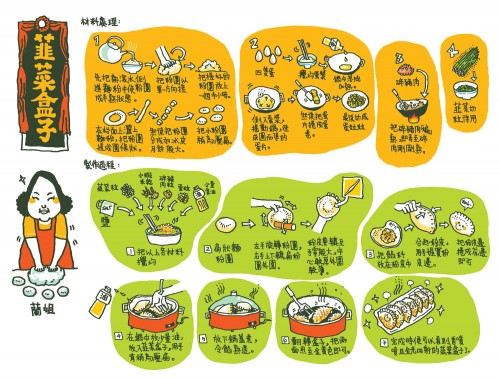
Although a little unlcear and somewhat messy (which i actually like) the illustrations really help and give a good idea of the processes of making the sushi.
I like the way that there dosen't see mto be a preconceived layout for the design which gives it a loose and organic feel.
Although clean and simple has its place, so does this journal/note taking form. It would fit well into a kind of kitchen/garden cookbook, or something as more of a stylised gift.
I think that I will go for more of a composed design however, and it can looks a bit messy. THe original can be found here: http://www.flickr.com/photos/montanaraven/18461280/in/photostream/

This recipe is really nice, by Felicita Sala. Its more of a illustrated list of the ingredients with little instructions thrown in, but it still flows nicely from left to right anf you get a good sense of how to make the recipe.
The illustrations are cartoony and the crayon style colouring gives off a nice naivity that would make the piece feel more inviting and maybe even easy to make.
This naivity would work well in a set of instructions for a younger audience.

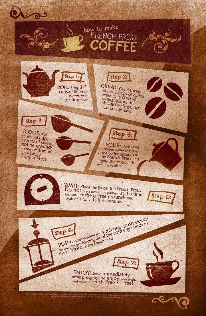
This final one by Justin Marimon is very clean and layed out really well. The silhouette style illustrations work really well and the colour palette is restricted echoing the coffe theme, and making it look composed.
I really like the way it is layed out, with the comic stylr frames that looks to be almost like building blocks. the hand rendered style font is really nice too.

I think its important in an instructional diagram to go simple with the illustrations and make sure it is clear what they are depicting.
Also a restricted pallette is good to make the whole thing come together.
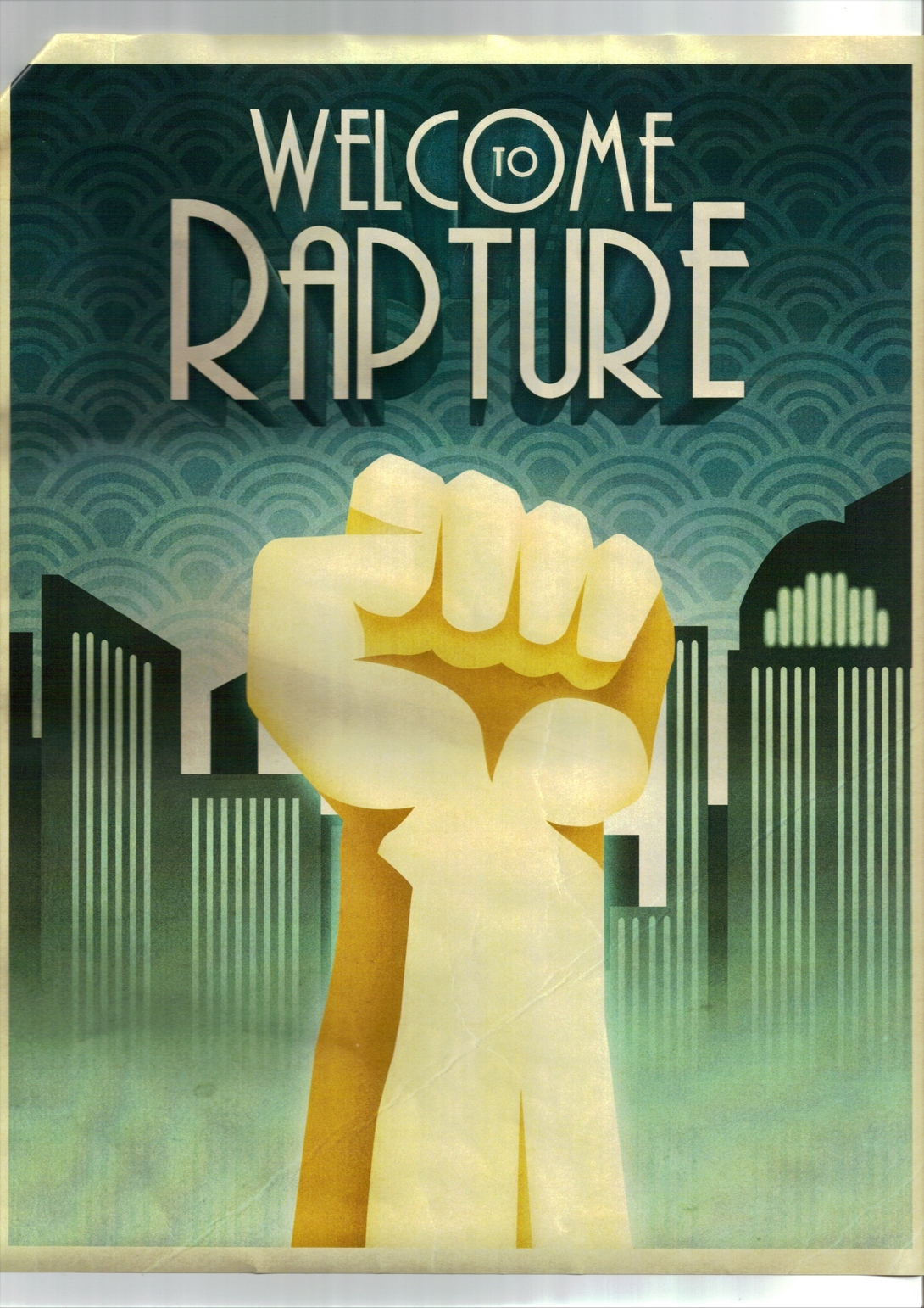
Childcare for Dummies


Its fairly unclear on the internet as to who made these illustrations, but it is clear to say that they are hilarious!
The each display a simple instruction to take care of your child, and shows both the correct way to do so and the very wrong was to do it.
I love the simple style of the illustrations and they look like official instructional diagrams because of this. Similar to things that can be seen in car manuals for example. The instructions are therefore easy to understand which in some cases could be life saving!

I love the humor used, especially in the bonding one. The pose of the woman in the 'NO' illustration is really well done and you get a great sense of her having a wild time, whilst the baby sits there...
I think the simplicity of the illustrations alone contribue to the humour a little because they look so serious, but clearly are not.

It also shows how instructional diagrams don't always have to be complex lists of things to do and not do, as here only 2 illustrations are used per picture. I don't like clogged up instructions as they are often confusing and hard to read, for me, simple is better especially as I want to aim my instructions at a younger audience. (My instructions will aim to look like instructions for a toy that would come in the toy's packaging.)

Sunday 30 October 2011

Dance Cheshire, Dance!


Click and enjoy...

 Click on these too

I also did these two little animations to test how I could take what I learned from this part of the module and apply to my other work. These illustrations were done for 'Illustration Friday' and I decided to animated small elements of them as an experiment..
They are a little crude, but they're a good example of ways to further my illustrations...


Friday 28 October 2011

Disney Animation- How is it done?


Watch this video! Its amazing and really interesting!

I have always wondered just how Disney made the animations back in the early 1900's. Today we can just use Photoshop or something similar to make a little animated sequence in no time as broadcast it to the world on the internet. More and more animated films are being 'chucked' out as if they grow on trees and its remarkable that Disney were doing this, but so long ago, and without the technology we have these days.
I never knew how they actually got the individual frames to move with each other, but it seems on this video that they take stills of each frame then run it through a camera. Much like the process were are doing.
Its to see how they layered up the frames, using a painted background and layering the characters over the top [who were traced and painted by 100's of pretty ladies of course] to create a complete scene. Its really cool and shows just how much work went into the films!

This has given me a great little insight and the processes and ideas will come in handy for sure!

Thursday 27 October 2011

Temperley London Circus Zoetrope


Temperley London Circus Zoetrope from LEGS MEDIA on Vimeo.

I love the looks of this Zoetrope contraption. It seems to work in a different way to normal zoetropes but uses the same principles. I love the vintage style photos used that give it a mystical feel, like the photos are coming to life.
This is something I tried to capture with my Cheshire Cat and hope it turns out the same...

Cheshire Cat Zoetrope Insert

These are photos of my the finished insert of the Cheshire Cat.
I made it by drawing the separate body part of the cat [head, body and tail] then photocopying 15 times.
I then cut out the individual parts [all 45 parts...] and began sticking them on the rectangles of paper that represented one frame on the Zoetrope.
I used little bits of card to raise the pieces slightly so that shadows will occur and highlight the cut-out aspect which I adore. I held the piece up to a light so that I could see through and therefore place the parts on the next frame in the correct place.

I then stuck the individual pieces together to create one lone strip. It was alot easier to do in small segments and Ive tried to make sure that as a long strip insert, it looks clean and professional.  

Overall I really like how it came out, and havent had the chance to test it yet, but it should look great!
Using the little bits of card to raise the head and body will make it slightly 3d and look more like a paper-puppet thing, like they use in Shadow Plays.

Im very pleased. It looks much cleaner and professional than the Llama animation, and the actual illustration is more refined and appealing.

 After testing out the insert in the Zoetrope, It looked quite good but was a little unclear to see because of the way I connected the frames, so that it bunched up in some areas. Also the lighting wasn't quite right so the big areas of white in the animation blended a bit much with the black lines making it hard to see.
However, it did actually work and his head definitely spun around. I decided to scan in individual frames and put them together into a GIF animation to see them at a better quality.
I think its really cool overall, and works well. The slight flickering adds a lovely vintage feel to it which makes the cat look more eerie and magical. 

Making the zoetropes and practice digital ones has really pushed my animation skills that I hadn't really developed much before. I feel animation could be more intune with my personal and professional work in the future and is something to look into further and keep working with. 

R James Healy- 3d Zoetrope


M16.2 3D Zoetrope from R James Healy on Vimeo.

I found this while looking for Zoetrope animations and It is wonderful!
The artist created a dairy style blog, looking at the production of the zoetrope as well as other things related. I really love the feel of 3d zoetropes and the seem much more magical. You get a real sense of something moving and it makes it much more real.
There is another one on the blog showing a bird flying and it looks just as amazing! Id love to create a 3d zoetrope but modeling 15 or so [almost] identical models would be extremely time consuming.
I can just imagine a 3d Chesire Cat spinning his head and such. It would have a very 'Burton' feel to it, and is something to definitely think about in the future.

Anyway, sit back and enjoy the 3d zoetrope!

Friday 21 October 2011

Final cheshire cat?


After much designing and things, Ive decided to draw the Cheshire Cat doing a handstand, whilst his head spins round and his tail wobbles..

I feel this is something the cat would do and it minimizes the movement slightly by focusing it on certain small elements as apposed to the whole cat moving.
I really love how these little animations turned out, they have a great hand-made feel to it as if they are shadow puppets or something.
The style of them references the original illustrations from Alice in Wonderland, with the pen and ink lines. Im really happy with them and want to replicate this traditionally and make it into an insert for the Zoetrope in the studio.

The blue one was just to see how it may look if I had cut around edges like in my viking comic strips.. to keep the same kind of style going. I like the jagedy-ness of it.